To post a new support question, click the Post New Topic button below.
Current Version: 5.2.5 | Sytist Manual | Common Issues | Feature Requests
Mobile View Help
hi does this program have mobile view? I have designed my website but when on mobile view its horrible ? as our creating pages can we test to see if it fits mobile?
Sytist is responsive and adjusts to the screen resolution of the device. This means it adjusts to a mobile view.
If you are using the Hero / Billboards in the page designer, the photo fills the elements. So at different screen resolutions the photos can get cut off.
See this article to adjust them to the screen resolution: Making Hero / Billboard Design Elements Adjust to Screen Resolution
Also if you have large text on elements, Sytist resizes them to the screen resolution but they may be too large to adjust enough.
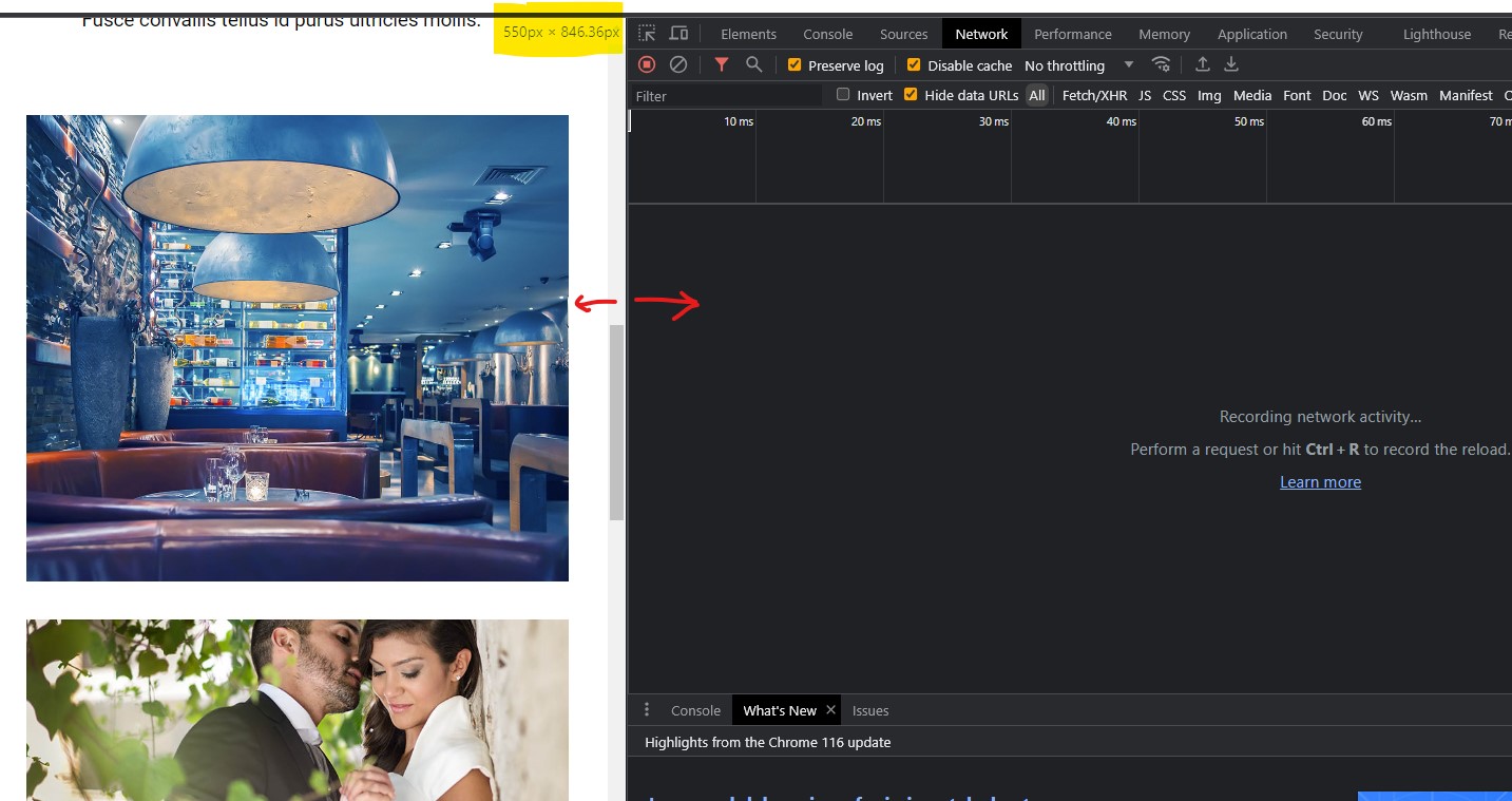
To change your browser to look more like mobile, open the developer tools (CTRL + SHIFT + i) and resize the screen area like in the attached screenshot. You can go around 500-600 pixels in width to see what it looks like on a phone.
My Email Address: info@picturespro.com

Loading more pages